Projections and Distortion in the News

 A colleague today brought in a newspaper clipping from the weekend edition of the Wall Street Journal for 13-14 April, 2013. It was a map depicting the extimated range of North Korea's Musudan missile. A couple of things were immediately interesting about this. First, the buffered area did not appear to actually be circular. Second, Alaska was tossed up in the upper right corner.
Working with GIS, I am well aware projections will make us all SADD. Projections distort shape, area, distance and direction. This map was interesting. At first, nothing really seemed right.
The odd position of Alaska could be accounted for if the analyst used a local projection, one centered on Korea. This would toss Alaska up toward the top. This would make sense for a map intended for public distribution, since it would make the circular ring appear round. In this map however, the ring was not circular either.
When my colleague brought this to my attention a few minutes ago, he simply asked, "Does this seem right to you?" We have the best spatial analysis tools in the world at our disposal. My response, "Let's see if we can recreate it."
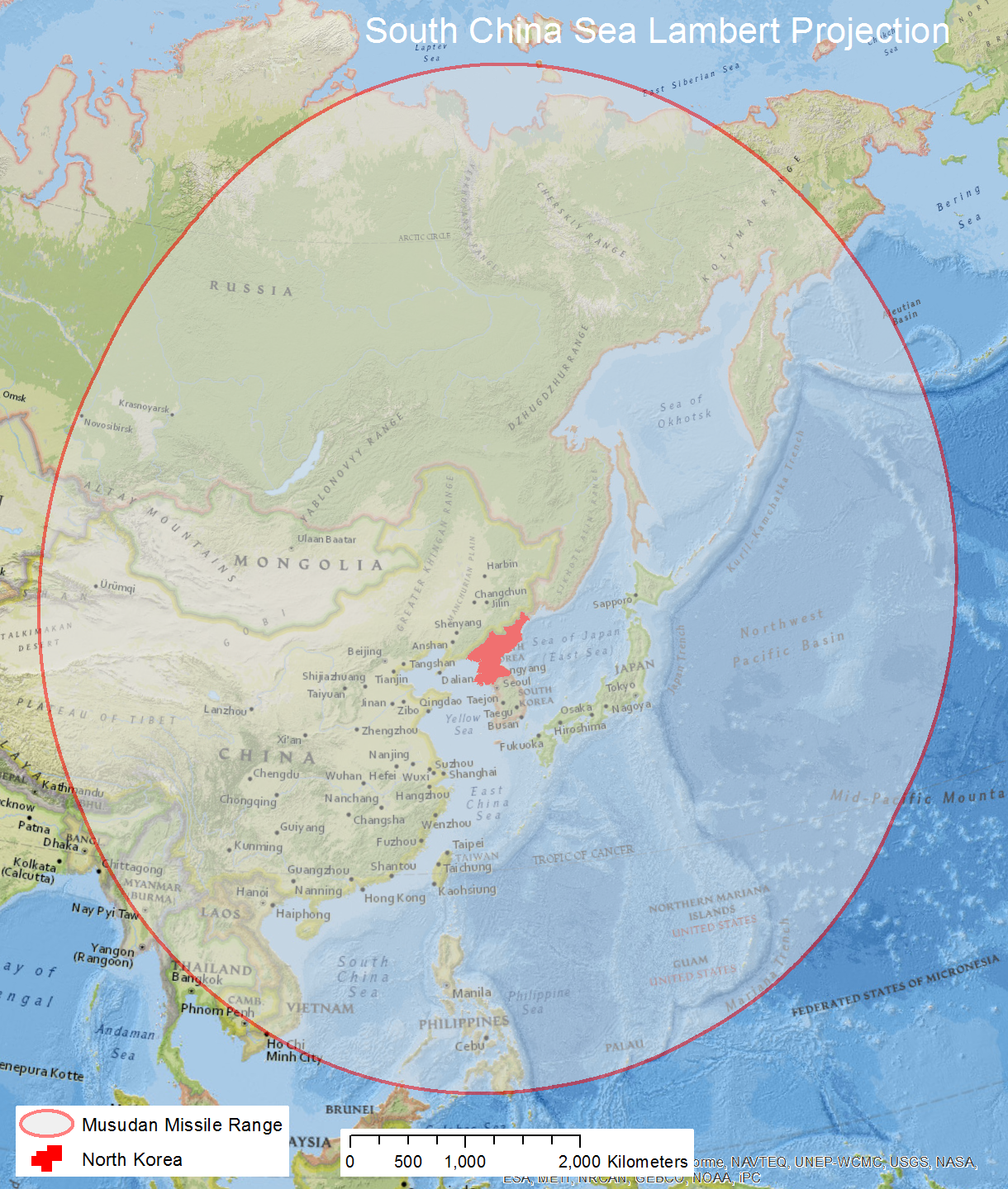
The slight elongation of the shape toward the north indicates a local projection was used. This local projection is not one for Korea, though. This local projection is one centered further south than the Korean peninsula. Digging around, I choose a South China Sea Lambert projection. It accommodated the entire area of the missile range and was further south than the area of interest, North Korea.
Next, we grabbed a country feature class from ArcGIS Online so we could not just buffer a point, but the whole country of North Korea. After adding this to the map, we selected Korea so it would be the only country buffered.
Before running the buffer tool, we also first made sure the country feature class had a geographic coordinate system. The buffer tool, if the input feature class is defined with a geographic coordinate system, will create a geodesic buffer, one correct across the surface of the earth, even if appearing distorted in the projection. The end result was very similar to what was displayed in the Wall Street Journal. Our layout is displayed below.
 Just because it is interesting, we did not stop there. We are, after all, GIS geeks. Next, we applied the most common projection almost anybody sees these days, Web Mercator Auxiliary Sphere. Almost without exception, this is the projection used by most online maps these days. Hence, if you were to put this on a Google Map, this is what it would look like.

As a final note, I deliberately did include the scale bar in these layouts to illustrate a point. There are many who argue for maps such as these, the scale bar should not be included since it is not accurate across the area of the map. It all just goes to prove, at the end of the day, projections will make you SADD.
Also, my hat's off to the Wall Street Journal. This was a job well done. Since the missiles are mobile, it makes sense to buffer the entire country, not just a single point. The buffered area was geodesic, not projected. This is important since distortion can be a major factor at these distances, especially at the higher latitudes. I am impressed.